The Foundation of Modern Engagement: Mobile-First App Screen Design
The shift in how we interact with digital products has been profound. The primary portal for most users is no longer a large desktop monitor but the compact, personal screen of a smartphone. This reality necessitates a fundamental rethinking of design philosophy, moving from a desktop-centric approach to one that begins with the mobile experience. This practice, known as mobile-first design, is not merely a technical adjustment but a holistic strategy that prioritizes user needs and context. When applied specifically to mobile app screens, it becomes the critical blueprint for creating intuitive, efficient, and engaging applications.
Why Starting Small Forces Big Improvements
At its core, mobile-first design for app screens is a constraint-driven creative process. Designing for the smallest screen first imposes a necessary discipline. Space is limited, touch interactions are primary, and user attention is often fragmented. Beginning here forces designers to strip away superfluous elements and focus on the absolute essentials. What is the core function of this screen? What is the single most important action a user should take? This rigorous prioritization, when successfully executed, results in a cleaner, more focused user interface. Subsequently, when expanding the layout for larger tablet or desktop views, you are scaling up a solid foundation of prioritized content and streamlined workflows, rather than trying to clumsily compress a complex desktop interface onto a tiny display.
The advantages of this approach are multifaceted. First, it inherently improves performance. Leaner designs with optimized graphics and simplified code typically load faster on mobile devices, a key factor in user retention. Second, it enhances usability. Interfaces designed for touch from the outset feature appropriately sized tap targets, intuitive swipe gestures, and a layout that accommodates one-handed use. Finally, it ensures consistency. The user experience feels cohesive as they move between devices, because the mobile version is not a stripped-down afterthought but the genuine source of the design language.
Visualizing the Process: From Wireframes to Editable Templates
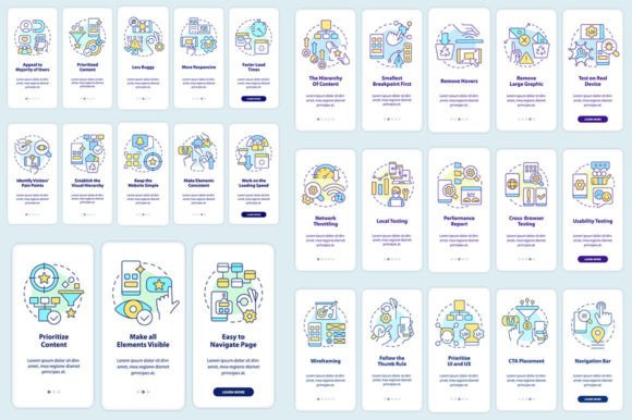
The journey from concept to a polished set of mobile app screens is a linear, step-by-step process, best supported by clear visual tools. Many designers and teams now utilize editable graphic templates to accelerate and standardize this workflow. These templates, often provided in versatile file formats like EPS, SVG, PNG, JPEG, and AI, serve as the foundational kits for screen design.
A typical walkthrough might begin with establishing the core screen layouts for key app functions—the login screen, the primary dashboard, a detail view, and a settings menu. Using a template set, a designer can quickly arrange these core mobile-first design mobile app screens without starting from a blank canvas. Font choices are integrated; for instance, using Myriad Pro-Bold for headers and Myriad Pro-Regular for body text establishes a clean, readable typographic hierarchy that works on small screens. Icons and common UI components like buttons, form fields, and navigation bars are pre-designed and editable, allowing for rapid customization while maintaining visual consistency.
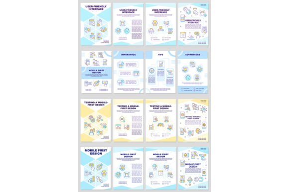
This templated approach is particularly valuable for creating brochure infographic templates that explain app features or for mocking up entire mobile app screen pages for client presentations or development handoff. The ability to edit in vector formats (AI, SVG) means the design remains scalable and adaptable throughout the project lifecycle.
The Real-World Impact on User Experience and Interface
The practical outcome of mobile-first thinking is a superior UI and UX. The user interface (UI) is tangible: the specific arrangement of elements on a mobile app screen template. It is what the user sees and touches. The user experience (UX) is the emotional and practical outcome of interacting with that UI. A mobile-first screen design directly shapes both.
Consider a task-driven app, like a banking application. A mobile-first screen for transferring money would place the amount entry field and the recipient selection at the very top, immediately accessible. The "Confirm Transfer" button would be large, clearly labeled, and positioned within the natural thumb-arc of one-handed use. Secondary information, like recent transactions or fee details, might be accessible via a swipe or a collapsible section below. This layout, born from mobile constraints, creates an interface that is not just usable but also feels swift and confident, leading to a positive UX.
This philosophy extends to all app genres. A content-consumption app, such as a news reader, would design its article screen first for mobile, ensuring comfortable reading with adjustable text size, easy scroll, and share actions attached to the article itself. The graphical user interface (GUI) template for such a screen would prioritize these content interaction patterns over decorative flourishes.
Who Benefits from This Approach and Available Resources
The audience for mobile-first design principles and ready-made screen assets is broad. Professionals, including UI/UX designers and product managers, use these frameworks to accelerate project timelines and maintain quality standards. Entrepreneurs and business owners leverage templates to visualize their app idea before committing to full-scale development. Educators and researchers might use these editable graphic instructions as teaching tools to demonstrate design principles. Even hobbyists and creators can utilize these resources to prototype personal projects or enhance their design skills.
The ecosystem for these resources is dynamic. Many studios and platforms offer comprehensive sets of mobile app screen templates, icons, and related graphic assets. To stay current with the latest visual trends, component libraries, and design techniques, engaging with these communities is beneficial. For instance, subscribing to a studio's updates ensures you learn about new topics and discounts every week, allowing you to continuously refine your toolkit and approach. Staying updated is not just about acquiring new files; it's about understanding evolving user behaviors and technological capabilities that influence how mobile first design mobile app screen sets should be constructed.
Implementing Mobile-First: Key Considerations and Iteration
Adopting a mobile-first strategy requires more than just purchasing a template kit. It demands a shift in planning and evaluation. The initial information architecture and user flow must be mapped out for the mobile context. Navigation patterns like bottom tab bars or hamburger menus need to be evaluated for their mobile efficacy. Content must be chunked and prioritized for progressive disclosure on small screens.
A critical consideration is testing. Prototypes built from your initial screen designs must be tested on actual mobile devices. This reveals issues with touch targets, readability under different lighting conditions, and performance on varying network speeds. This iterative process—designing core screens, building a prototype, testing with users, and refining—is the engine that transforms a static template into a living, effective application interface.
Furthermore, while templates provide a fantastic starting point, customization is essential. Your app's unique brand and functionality must be infused into the screens. The color scheme, the specific iconography, and the micro-interactions (like how a button presses or a list item expands) should be tailored to create a distinct and memorable experience that still adheres to mobile-first usability principles.
In conclusion, the design of mobile app screens starting from the smallest and most constrained viewport is a practice rooted in user-centricity. It champions clarity over clutter, speed over complexity, and context over generic solutions. By leveraging structured processes, editable graphic templates, and a commitment to continuous learning from the broader design community, anyone involved in creating digital products can build applications that feel native, intuitive, and indispensable to the user's mobile life. The screen is the point of contact; designing it first for the device that matters most is the path to meaningful engagement.